If you have analytics installed on your site, you already know how useful it is to see the pages your visitors look at the most.
But that only tells you a part of the story.
When you imagine someone visiting your site, you might be picturing someone on their laptop, but there are undoubtedly lots of visitors accessing the site on their phone.
Of course, the burning question is, “How many people are visiting my site on mobile vs. desktop?“
Knowing the traffic share of mobile vs. desktop devices will help greatly in understanding the experience of your visitors and will make design UX changes simpler.
And all you need to get started are the right tools.
How to track mobile vs. desktop traffic
In order to find the devices your visitors use, you’ll need to install an analytics tool that records device data.
The good news is that there are many tools available, and the ones we’ve included here are all free.
Here’s our first recommendation…
Independent Analytics
Independent Analytics is a free WordPress plugin we developed as a simpler alternative to Google Analytics.
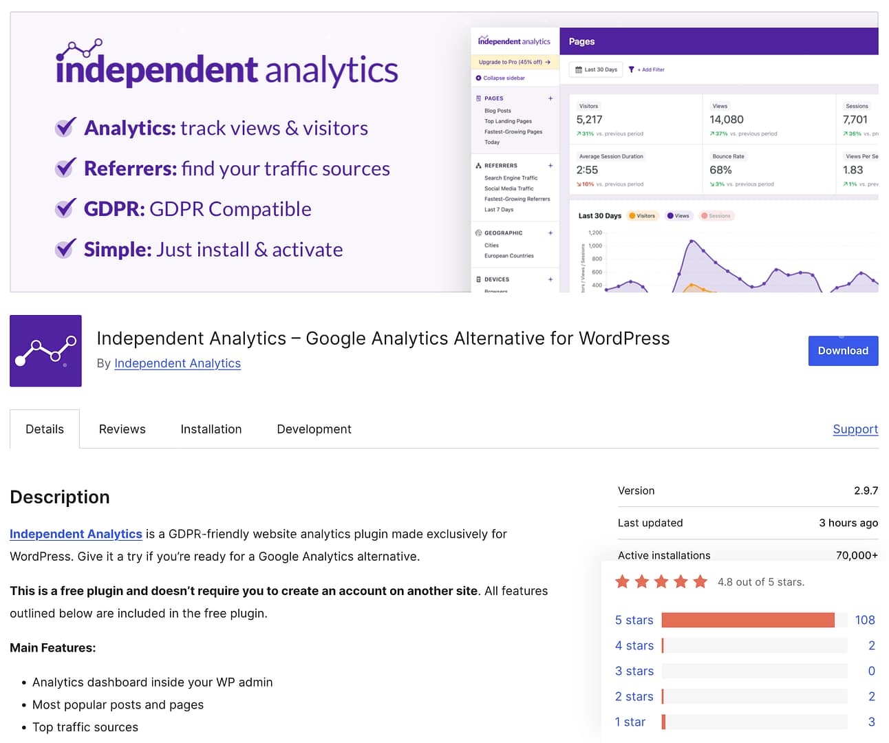
It’s fast, easy to install, GDPR-friendly, and adds a full analytics dashboard right inside the WP admin.
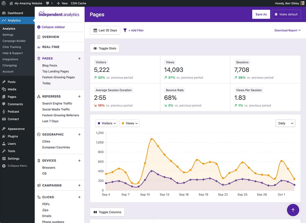
More relevant to the topic at hand is the Devices report, which plainly shows you how much traffic your site receives from each device type.
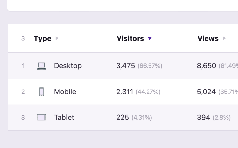
For most websites, you’ll see the following three device types:
- Mobile
- Tablet
- Desktop
However, Independent Analytics tracks seven different device types, including gaming consoles, wearables, and even cars. As people use increasingly diverse ways to access your website, it’s important to be able to monitor these trends.
You’ll also appreciate that metrics like bounce rate and average session duration are available, allowing you to compare the engagement of each device type. You can use this data to figure out if users are having a bad experience with one type of device vs. another.
Download a free copy of Independent Analytics.
Other device-tracking tools
There are a few other free analytics tools that can tell you about the devices used to visit your website.
If you’re using WordPress, the WP Statistics plugin includes a wealth of data and shows a pie chart that breaks down your devices by type.
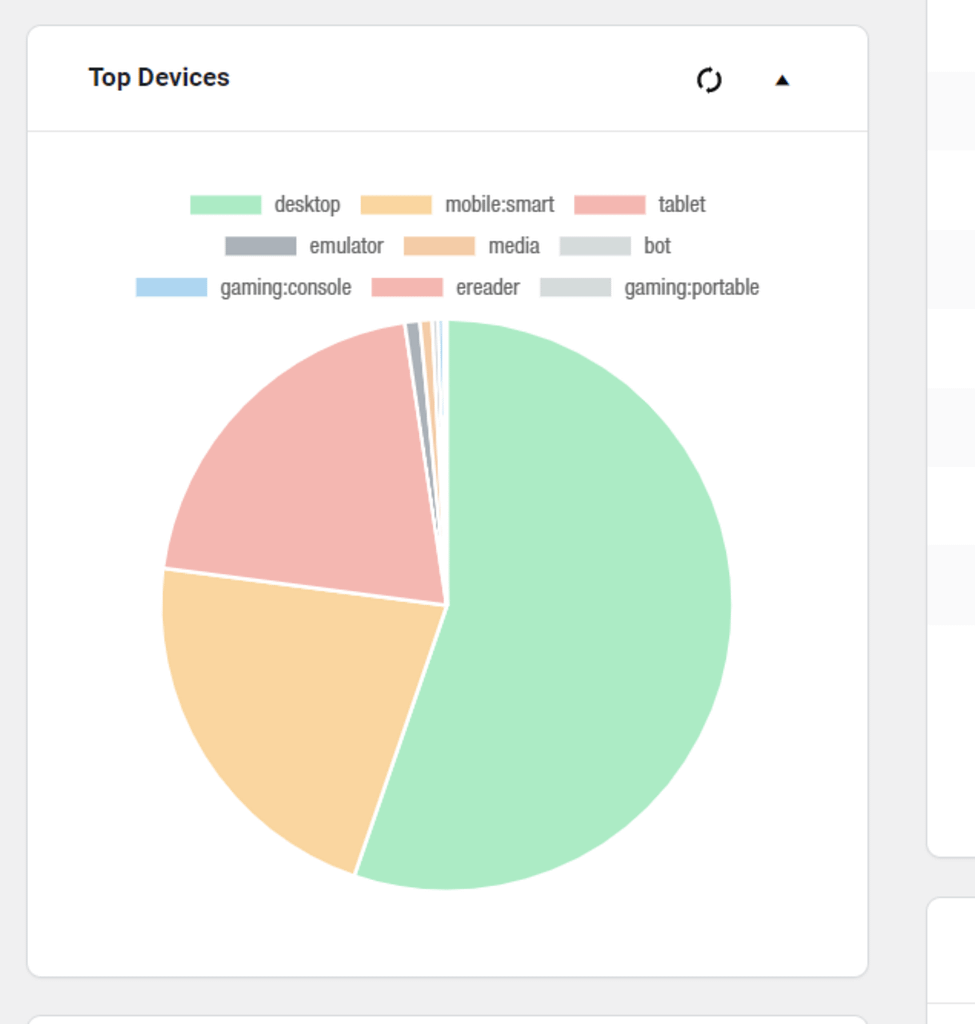
This makes it easy to compare traffic between mobile vs. desktop at a glance, but it does not include engagement metrics like bounce rate and exit rate.
If you want a more traditional analytics interface, you might like Matomo. It’s CMS-agnostic, so you can use it on any website. They have a WordPress plugin for easy integration if you’re interested in that.

The device data is robust and makes it simple to view traffic by device. Their platform is free to use but does limit how many visits you can record before paying.
Now that you have a few options to pick from let’s talk about how to best use this data.
Mobile optimization tips
If the majority of your visitors are using mobile devices, then you’ll want to take mobile optimization seriously.
Prioritize responsive design: For starters, make sure your website is responsive. If you’re using WordPress, virtually all themes are now responsive by default. Ideally, all the same content from your desktop site will be available on the mobile version too. You’ll want to browse your site yourself to ensure everything is present and displayed nicely.

Test your pop-ups: If your site uses popups, make sure they fit well on the screen and have a close button that is easy to click. If the popup is too difficult to close, they’ll simply leave your site.
Optimize your images: One other thing to check is the size of your images. Make sure they scale down to fit easily on the site and include a lightbox if they become too small to view. Additionally, you will want to serve scaled-down versions that load quickly. A plugin like Optimole can help with this.
Desktop optimization tips
If you’re running your own website, then you’re probably used to seeing it on a laptop rather than a phone. You’re less likely to discover bugs and visual glitches you haven’t seen before.
However, this doesn’t mean there aren’t situations you need to optimize for.
Test extra-wide screens: One thing you need to do is check your site on an extra-wide monitor. If your site doesn’t limit its width, it could end up stretched extremely wide across the screen, messing up image aspect ratios and creating super long lines of text.
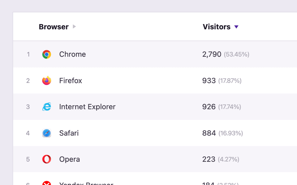
Try different browsers: Desktop computers also see a much wider range of browsers, so it’s important to check your traffic by browser too. Compatibility issues are less common these days but still occur in some browsers.
Start tracking device type data today
Tracking what types of devices your visitors use is vital to understanding your audience.
With this data, you’ll have a much clearer picture of what your visitors are like and how they’re experiencing your website.
If you’re using WordPress and want a free plugin to track your mobile vs. desktop traffic, try our plugin:
Get started with Independent Analytics
It takes seconds to install and starts reporting on your devices right away.
Thanks for reading this guide on web traffic by device, and feel free to leave a comment below if you have any questions.


